Project Director: Nairi Khatchadourian
Art Director: Sargis Antonian
Strategy Designer: Tatev Petrossian
Graphic Designers: Artashes Avetyan, Edik Boghosian, William Karapetyan, Garegin Martirosyan
Copywriter: Artavazd Yeghiazaryan
Tourism Specialist: Lilit Khachaturyan
Photo Editor: Vahan Stepanyan
Photographers: Vahan Stepanyan, Karo Sahakyan, Tigran Mehrabyan, Davit Hakobyan, Davit Abrahamyan
Brand Manifest Animation
Motion Designer: Davit Gyumishyan
Sound Design Director: Miqayel Voskanyan
Sound Designer & SFX: Raffi Hayrapet
Sound Production Assistant: Nate Nakhian
Musicians: Grigor Davtyan (Armenian percussions), Rafik Avagyan (Blul),
Vardges Shahinyan (Duduk), Nubar Hayrapetyan (Qanun)
Sound Production: Oberton Music
The brand was created within the frames of the EU4Business “Innovative Tourism and Technology Development for Armenia’’ project supported by the European Union and the German Federal Ministry for Economic Cooperation and Development (BMZ)
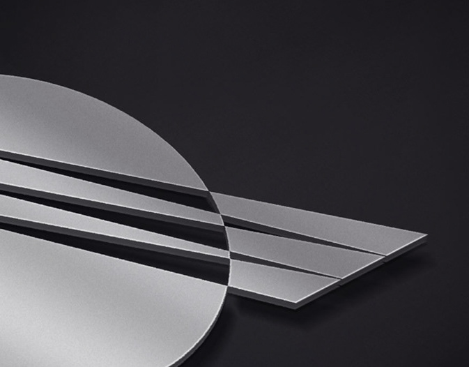
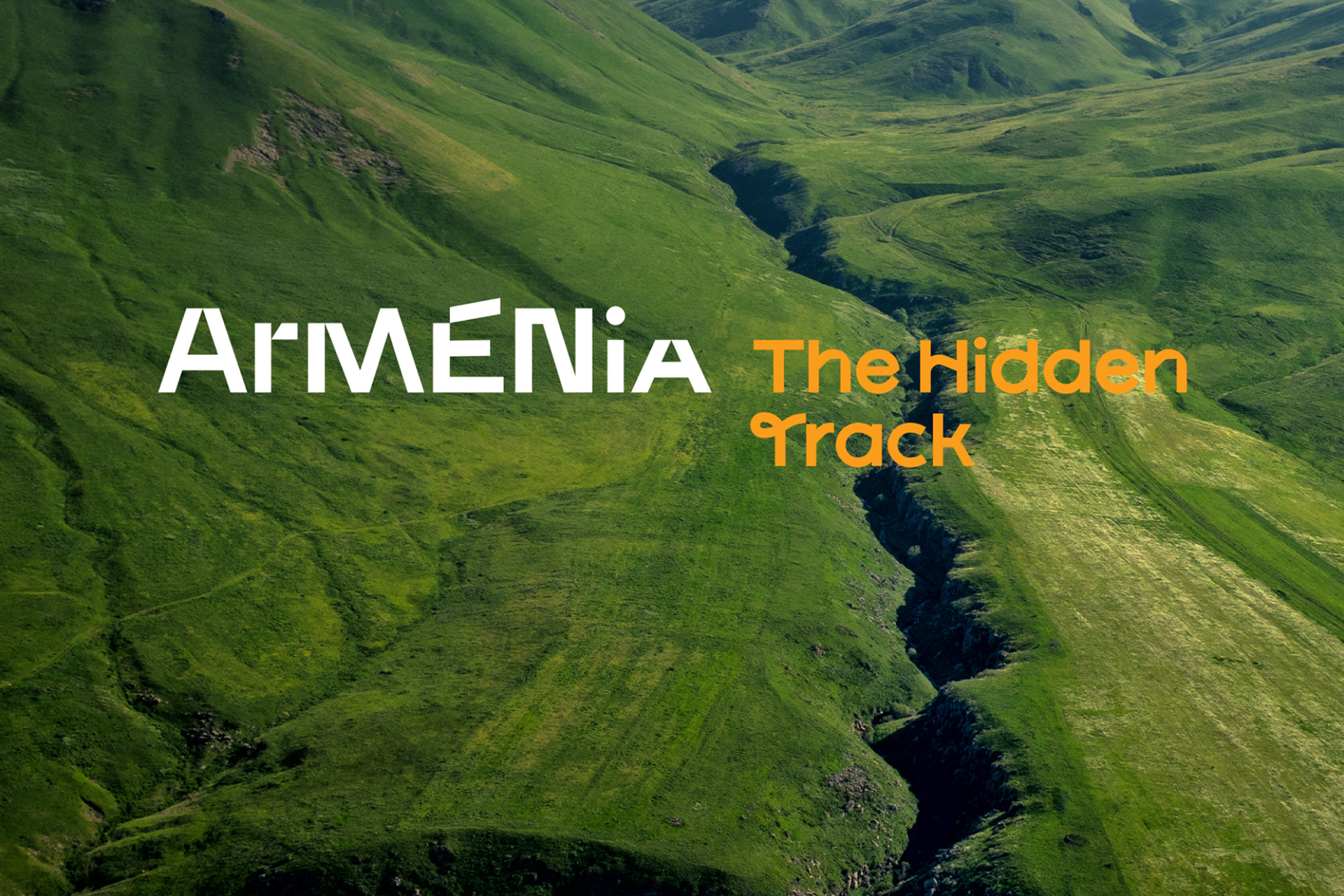
The Wordmark
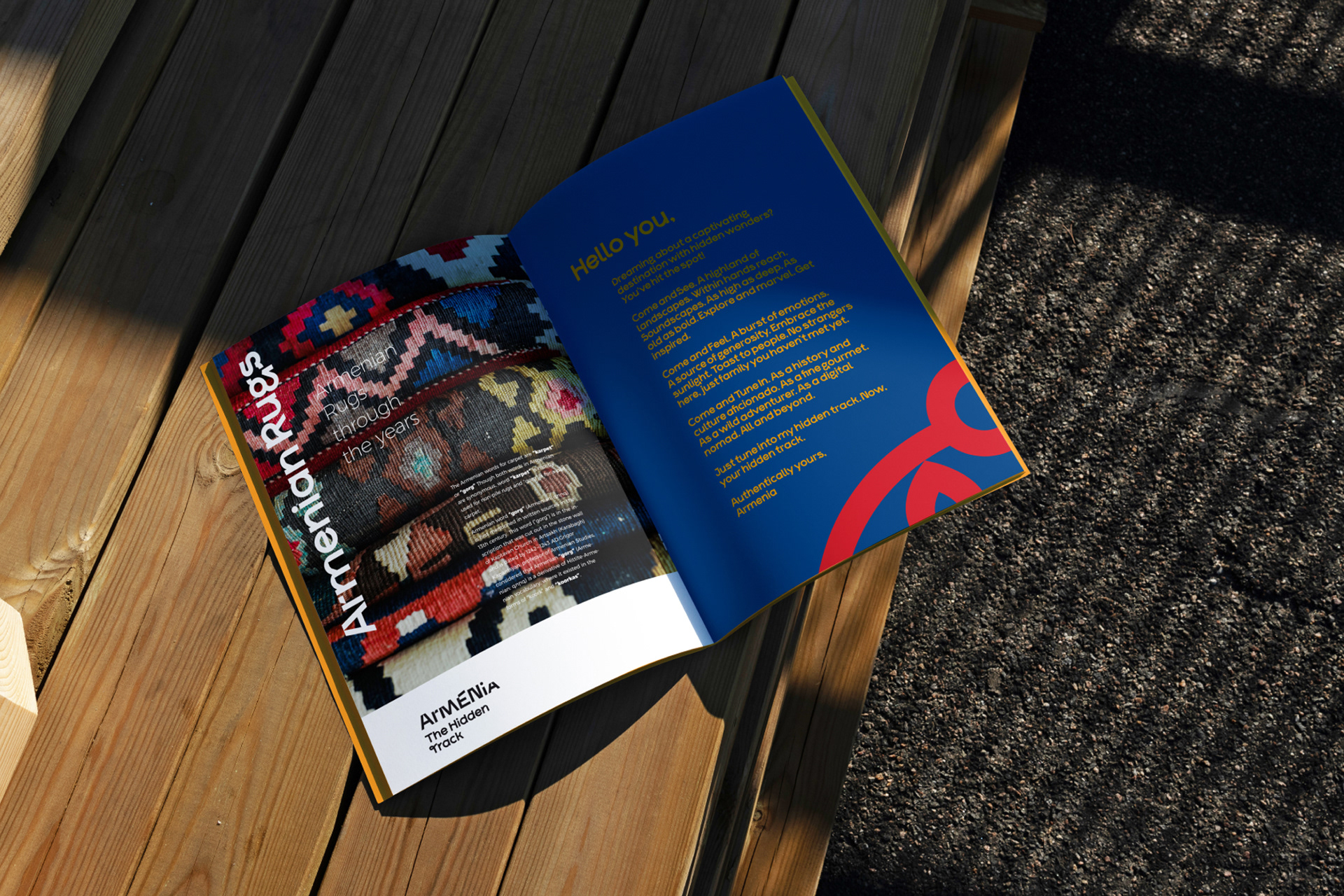
The wordmark is based on dynamic movements in the letterforms reflecting the soundscape concept and the mountainous landscapes of Armenia. Its bespoke typeface is anchored in the rich rhythm of life tourists experience in Armenia. Together with the tagline, the wordmark literally invites the visitor in a journey of constant discovery through Armenia's magnetic high peaks and deep gorges, authentic experiences offering spontaneous and surprising emotions.
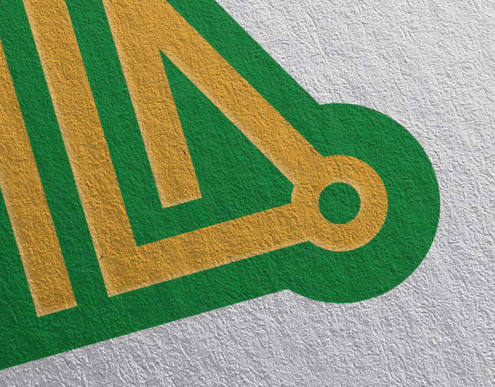
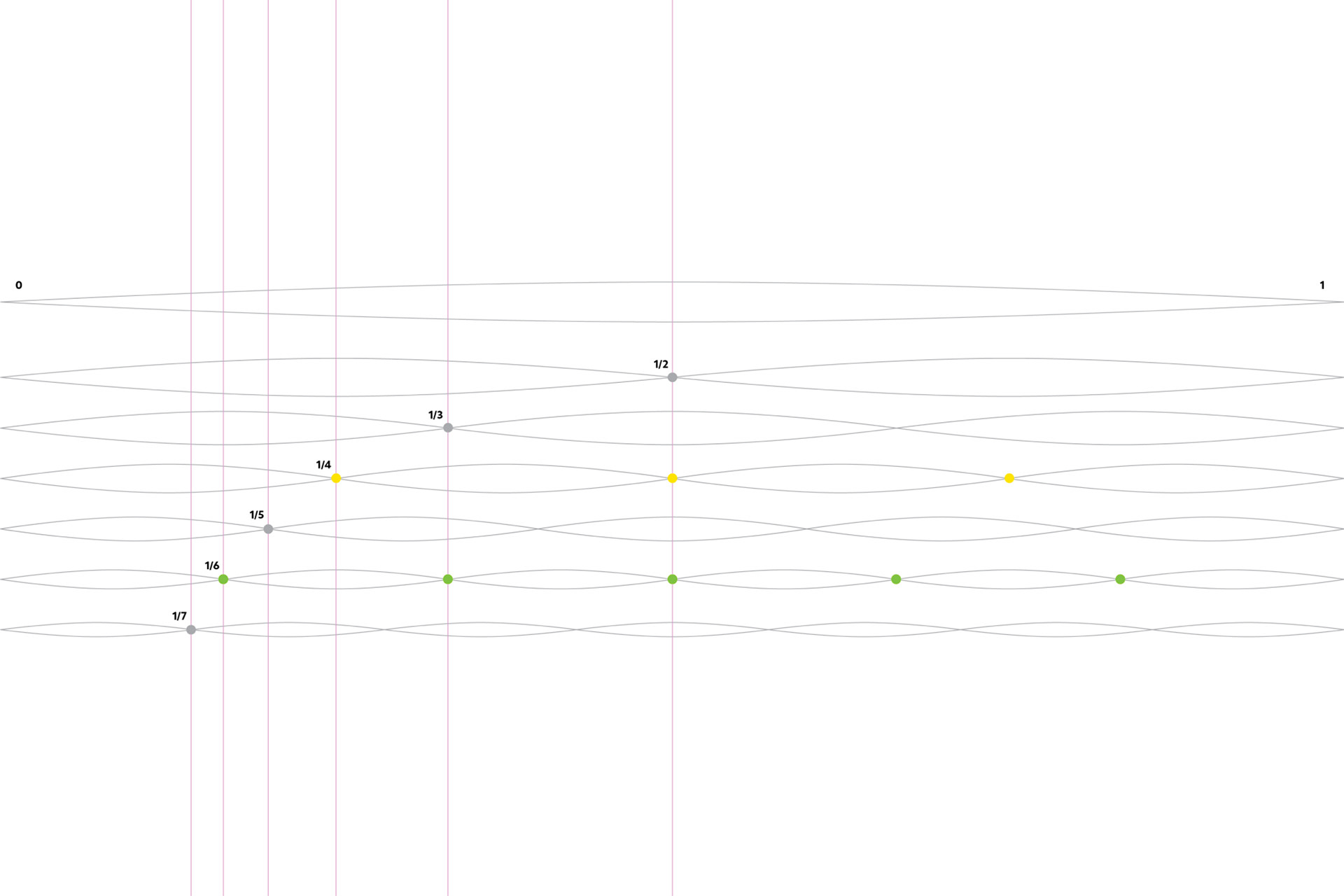
Obertone Grid
The brand has its custom-made grid entitled Oberton to design different layouts. The grid is inspired by the overtone and its vibrational series (1st through 7th harmonics). By using the main nodes, a dynamic grid is defined as a base following a left to right progressive rhythm allowing within the framework rich flexibility to design communication materials.
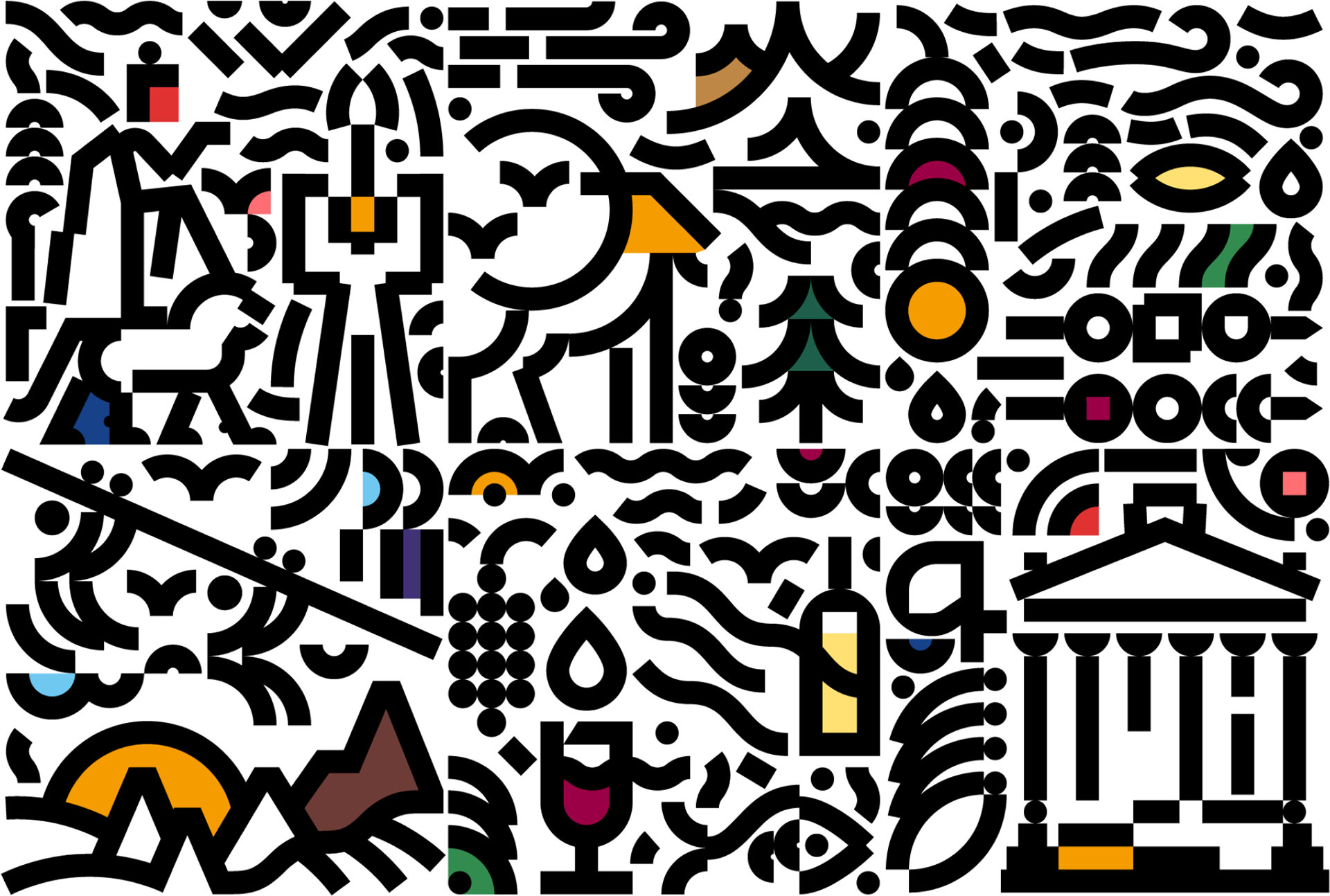
Mixed Illustrations
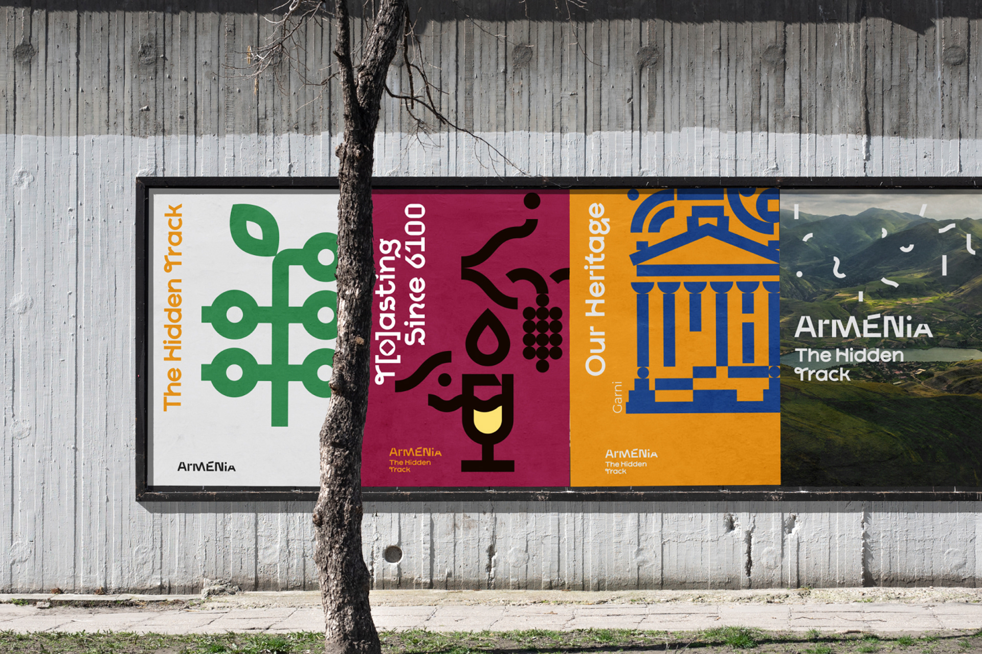
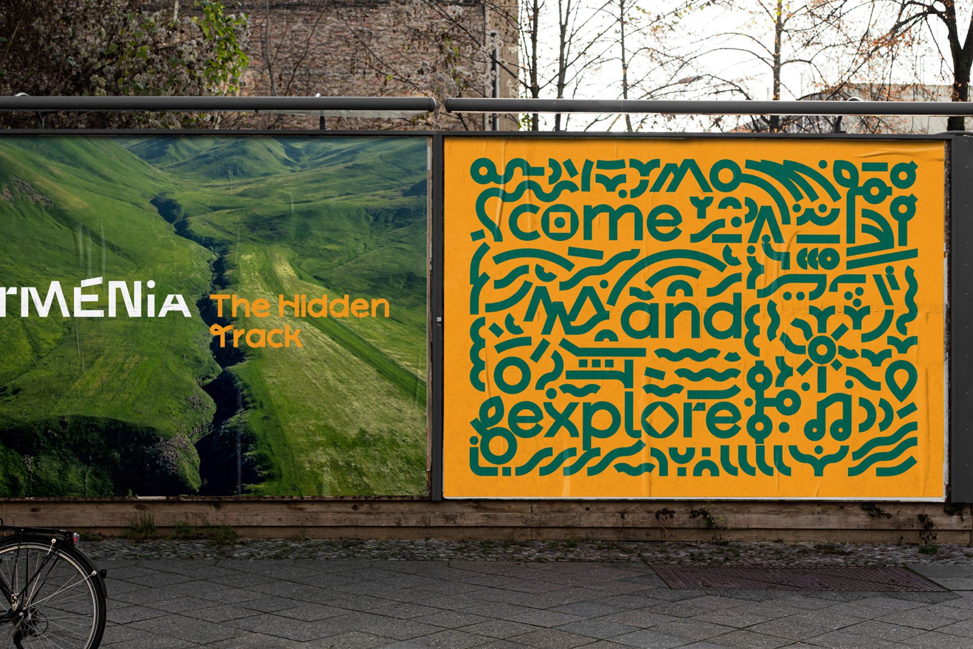
For general promotional materials, illustrations from different cluster groupings (gastro, nature, adventure, culture) can be used together. The illustrations can be used with their color pairings and in black & white.
Visual Vectors
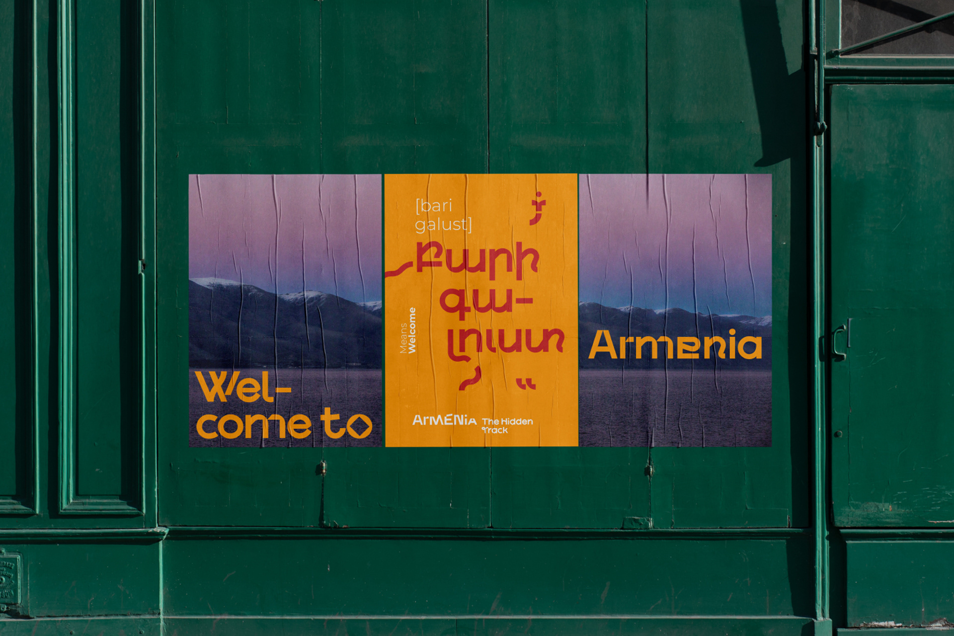
The brand's visual vectors are designed to amplify the country’s storytelling as an ongoing, long-term story arc, and enhance the connection with existing and new visitors. The language translation series engages the visitors in a friendly dialogue with locals and facilitate their immersive experience by learning Armenian travel vocabulary. The photographic series is designed in a way to show the rich and appealing sides of the country and get acquainted with the contrasted and magnetic assets it has. The illustration series is designed in a way to offer a playground for creative exchange between the brand and its multigenerational users.